Platform-wide Visual & UX Modernization
@Moody's Analytics
I served as Lead Visual Designer on a platform-wide modernization effort spanning six of Moody's Analytics' flagship financial products. My responsibility was to define and implement a new visual language that improved usability, accessibility, and performance, while maintaining consistency across products used daily by enterprise banking clients.

Overview
Moody's Analytics provides financial tools to some of the largest institutions in the global financial industry. At the time of this project, six of its primary products, core to the business and widely used by enterprise customers, were showing clear signs of UX and UI degradation.
The experience across these tools was:
This initiative was driven by a key enterprise client, Nova Scotia Bank, whose bankers were the primary users of these tools. The effort ultimately expanded to benefit all Moody's Analytics customers once released.
Scope
This was not a simple visual refresh. It was a platform-wide redesign effort, combining replatforming, visual system redesign, and UX and interaction improvements layered onto existing workflows.
Defining the Problem
The core challenge was to modernize the visual and interaction layer across six interconnected products, without disrupting critical financial workflows, while establishing a shared visual foundation that could scale.
Specifically:
- Each product had evolved independently, resulting in inconsistency
- Visual hierarchy was weak, increasing cognitive load
- Accessibility standards were inconsistently applied or missing
- Data visualizations relied on color in ways that reduced clarity and inclusivity
The Opportunity
Create a cohesive, accessible visual system that improved usability and performance across the entire suite.
Goals
Define a New Visual Language
Create a modern, cohesive visual system that could be adopted across all six products while accounting for existing features and net-new business requirements.
Embed Accessibility Standards
Build accessibility into the foundation: typography, color, iconography, spacing, and interaction states, rather than treating it as an afterthought.
Redesign Data Visualization
Establish a new, accessible color palette and styling approach for complex financial charts and dashboards.
My Role & Responsibilities
As Lead Visual Designer, I was responsible for shaping the visual direction of the platform and delivering production-ready assets.
Key Responsibilities
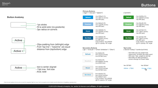
- Defining foundational visual elements (color, iconography, spacing, radius, interaction states)
- Designing a complete iconography library
- Proposing and defining typography specifications
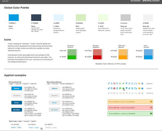
- Establishing a new color palette for UI and data visualization
- Designing and contributing to new components and patterns
- Delivering high-fidelity designs and prototypes for engineering
Collaboration
While final UX decisions were owned by team leadership, I was empowered to propose UX and IA improvements and collaborated closely with UX designers and engineers across product teams.
Notable Ownership
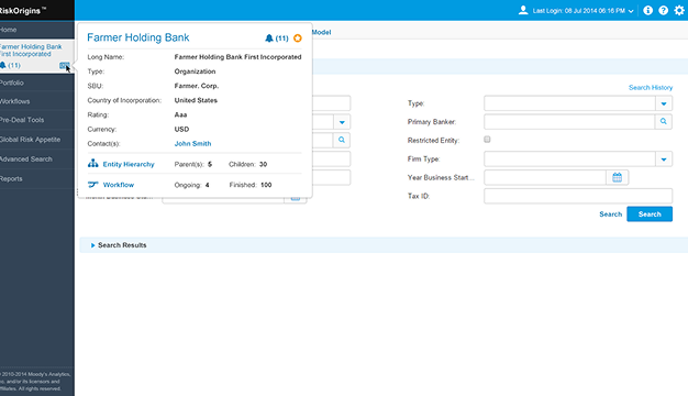
One notable component I owned end-to-end was the Customer Card, a core pattern used across multiple products.
Approach
Designing from the Foundations Up
I approached the problem by starting with the most atomic elements of the interface and letting those decisions cascade upward.
- Designed a new icon library first, using it to establish a consistent visual tone and level of detail
- Built a color system grounded in a single primary color, deriving secondary and tertiary colors to ensure harmony
- Accessibility considerations, especially color contrast, were baked in from the start using WCAG standards
This foundation informed component styling, interaction states, and layout decisions across all six products.
Consistency Across Products, Not Uniformity
One of the primary challenges was maintaining consistency while respecting product-specific needs. My focus was on:
- Shared visual rules (color, spacing, iconography)
- Consistent interaction states and hierarchy
- Allowing product teams flexibility within a common system
Other teams adopted the colors, icons, and spatial systems I defined, helping align the suite visually without forcing identical layouts.
Accessibility & Data Visualization
Accessibility was a core requirement throughout the project.
- WCAG standards guided color contrast decisions
- Interaction states were designed to be clear without relying on color alone
- Dark mode was intentionally deprioritized in favor of maximizing clarity and color-blind accessibility
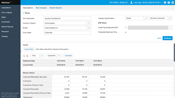
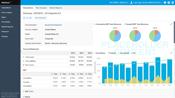
Data Visualization Ownership
I also owned the redesign of data visualization components, including charts and dashboards. Color had been a major pain point in the existing experience, so I was given latitude to define a new data visualization palette, establish clearer distinctions between data types, and reduce reliance on color alone to convey meaning.
Challenges
Tight Timelines & Decision-Making
The project ran on two-week sprints using Scrum, which required fast iteration and strong alignment.
While I had influence, final decisions flowed through team leads and management, requiring clear rationale and well-articulated design thinking.
Typography Debates
Typography proved to be the most contentious aspect of the work. The team held strong and differing opinions, resulting in extended deliberation.
Ultimately, the group aligned on a single direction to maintain momentum: a reminder that progress sometimes requires compromise, even when no option is perfect.
Results
What Shipped
- A new visual language applied across six flagship products
- A complete iconography library in production
- A new color palette used across UI and data visualization
- Updated components, interaction states, and patterns
- Improved accessibility through contrast and hierarchy
All visual styling attributes and components I designed shipped to production.
Impact
Reflection
This project reinforced the value of strong visual systems as a multiplier for UX, especially in complex, data-heavy enterprise tools.
Operating within tight timelines, partial authority, and multiple product teams sharpened my ability to:
Influence without owning final decisions
Balance accessibility, aesthetics, and performance
Deliver scalable visual foundations under pressure
The experience directly informed how I later approached larger-scale system and UX ownership at Wells Fargo and Flexport.
Visual Artifacts